The Organisation for Economic Co-operation and Development host a database with extensive data. In this post we will do some visualizations to compare the number of dentists in each country.
Packages used:
- tidyverse
- gghighlight
- kableExtra
First we load the data. Now there is a package (OECD) able to extract the datasets, but I will use a local copy:
dent_oecd <- read_csv("https://docs.google.com/spreadsheets/d/e/2PACX-1vStv7Pr69DtRKv6Nw6gVBep8hbT3pEeO6B1vNwxK_1DUHgpoTgbuRpZ4SvgtHFQnBZJVGeeQVyRuXZl/pub?gid=1330297229&single=true&output=csv")## Parsed with column specification:
## cols(
## VAR = col_character(),
## Variable = col_character(),
## UNIT = col_character(),
## Measure = col_character(),
## COU = col_character(),
## Country = col_character(),
## YEA = col_double(),
## Year = col_double(),
## Value = col_double(),
## `Flag Codes` = col_character(),
## Flags = col_character()
## )Always is preferable to take a look the data and its structure:
head(dent_oecd)## # A tibble: 6 x 11
## VAR Variable UNIT Measure COU Country YEA Year Value `Flag Codes`
## <chr> <chr> <chr> <chr> <chr> <chr> <dbl> <dbl> <dbl> <chr>
## 1 HEDU… Dentist… NOMB… Number AUS Austra… 2008 2008 552 <NA>
## 2 HEDU… Dentist… NOMB… Number AUS Austra… 2009 2009 632 <NA>
## 3 HEDU… Dentist… NOMB… Number AUS Austra… 2010 2010 665 <NA>
## 4 HEDU… Dentist… NOMB… Number AUS Austra… 2011 2011 684 <NA>
## 5 HEDU… Dentist… NOMB… Number AUS Austra… 2012 2012 723 <NA>
## 6 HEDU… Dentist… NOMB… Number AUS Austra… 2013 2013 894 <NA>
## # … with 1 more variable: Flags <chr>glimpse(dent_oecd)## Observations: 956
## Variables: 11
## $ VAR <chr> "HEDUDNGR", "HEDUDNGR", "HEDUDNGR", "HEDUDNGR", "HE…
## $ Variable <chr> "Dentists graduates", "Dentists graduates", "Dentis…
## $ UNIT <chr> "NOMBRENB", "NOMBRENB", "NOMBRENB", "NOMBRENB", "NO…
## $ Measure <chr> "Number", "Number", "Number", "Number", "Number", "…
## $ COU <chr> "AUS", "AUS", "AUS", "AUS", "AUS", "AUS", "AUS", "A…
## $ Country <chr> "Australia", "Australia", "Australia", "Australia",…
## $ YEA <dbl> 2008, 2009, 2010, 2011, 2012, 2013, 2014, 2015, 200…
## $ Year <dbl> 2008, 2009, 2010, 2011, 2012, 2013, 2014, 2015, 200…
## $ Value <dbl> 552, 632, 665, 684, 723, 894, 861, 957, 118, 134, 1…
## $ `Flag Codes` <chr> NA, NA, NA, NA, NA, NA, NA, NA, NA, NA, NA, NA, NA,…
## $ Flags <chr> NA, NA, NA, NA, NA, NA, NA, NA, NA, NA, NA, NA, NA,…And a summary:
summary(dent_oecd)## VAR Variable UNIT
## Length:956 Length:956 Length:956
## Class :character Class :character Class :character
## Mode :character Mode :character Mode :character
##
##
##
## Measure COU Country YEA
## Length:956 Length:956 Length:956 Min. :2008
## Class :character Class :character Class :character 1st Qu.:2010
## Mode :character Mode :character Mode :character Median :2012
## Mean :2012
## 3rd Qu.:2014
## Max. :2016
## Year Value Flag Codes Flags
## Min. :2008 Min. : 0.00 Length:956 Length:956
## 1st Qu.:2010 1st Qu.: 1.34 Class :character Class :character
## Median :2012 Median : 6.00 Mode :character Mode :character
## Mean :2012 Mean : 3064.18
## 3rd Qu.:2014 3rd Qu.: 1071.00
## Max. :2016 Max. :100994.00I will use the Dentists graduates, and Per 100 000 population so let’s filter and replace the former data set
dent_oecd <- dent_oecd %>%
  filter(Variable == "Dentists graduates",
         Measure == "Per 100 000 population")
There are some useless columns, so unselect them
dent_oecd <- select(dent_oecd, -c(VAR, UNIT, COU, YEA,`Flag Codes`, Flags))Let’s plot. Since is a temporal trend, a line plot could be a good idea:
dent_oecd %>%  # this means: take the dent_oecd dataframe, and
  ggplot(aes(x = Year, y = Value, color = Country)) + #plot the year in the X axis, the value in the y axis and color the lines per country
  geom_line() +
  labs(y = "Dentists graduation per 100 000 hab")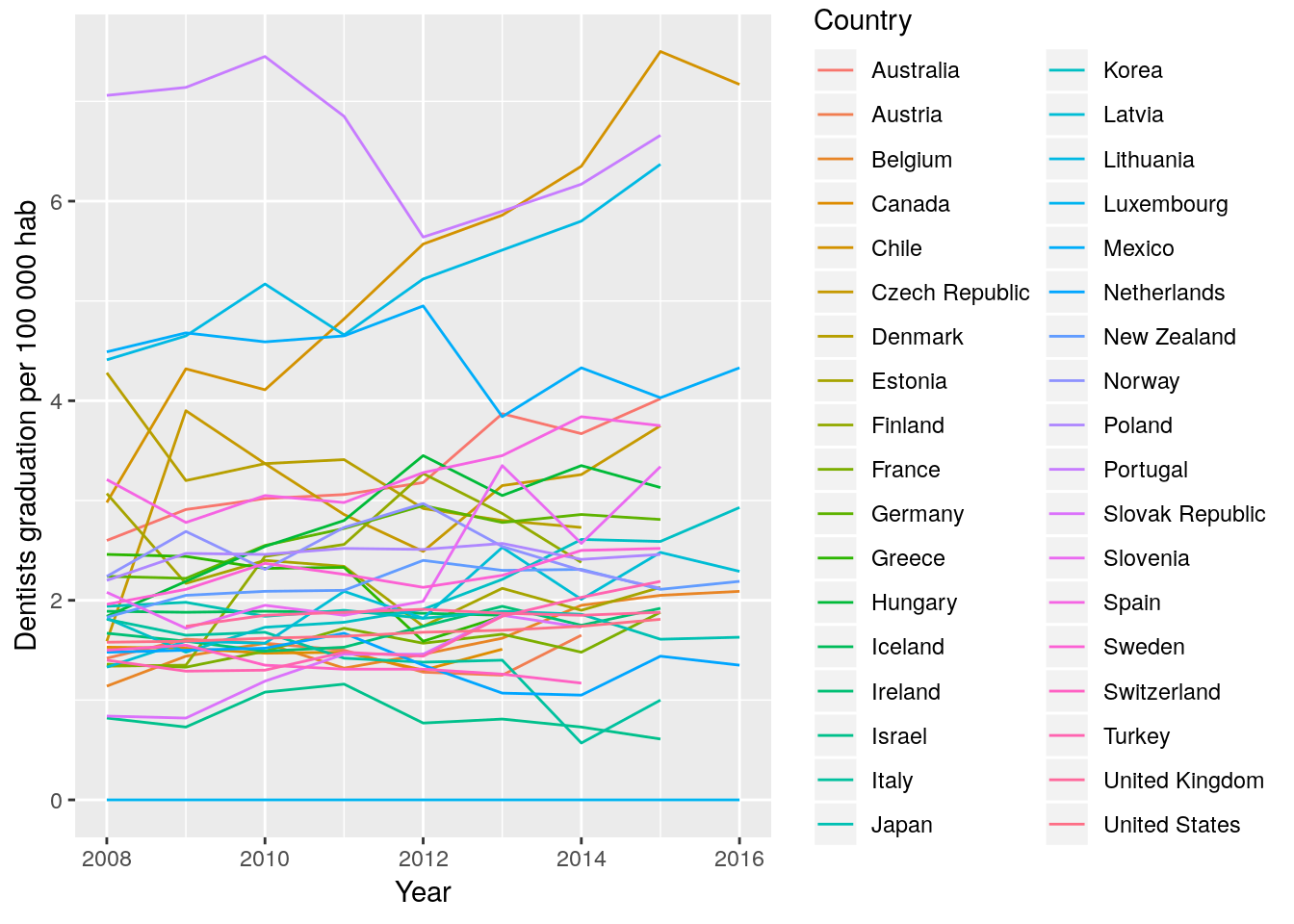
Hmmm….the problem here is that isn’t easy to differentiate the countries.
We have to choices: 1. plot each country separate, or 2. highlight one or few countries from the group we can use the package
1. Plotting one graph per country: faceting.
dent_oecd  %>%
    ggplot(aes(x = Year, y = Value)) + # we delete the color = Country, since is not necessary
  geom_line() +
  facet_wrap(~Country) + #this means: plot separately each country
  theme(axis.text.x = element_text(colour="grey20",size=6)) +
  labs(y = "Dentists graduation per 100 000 hab")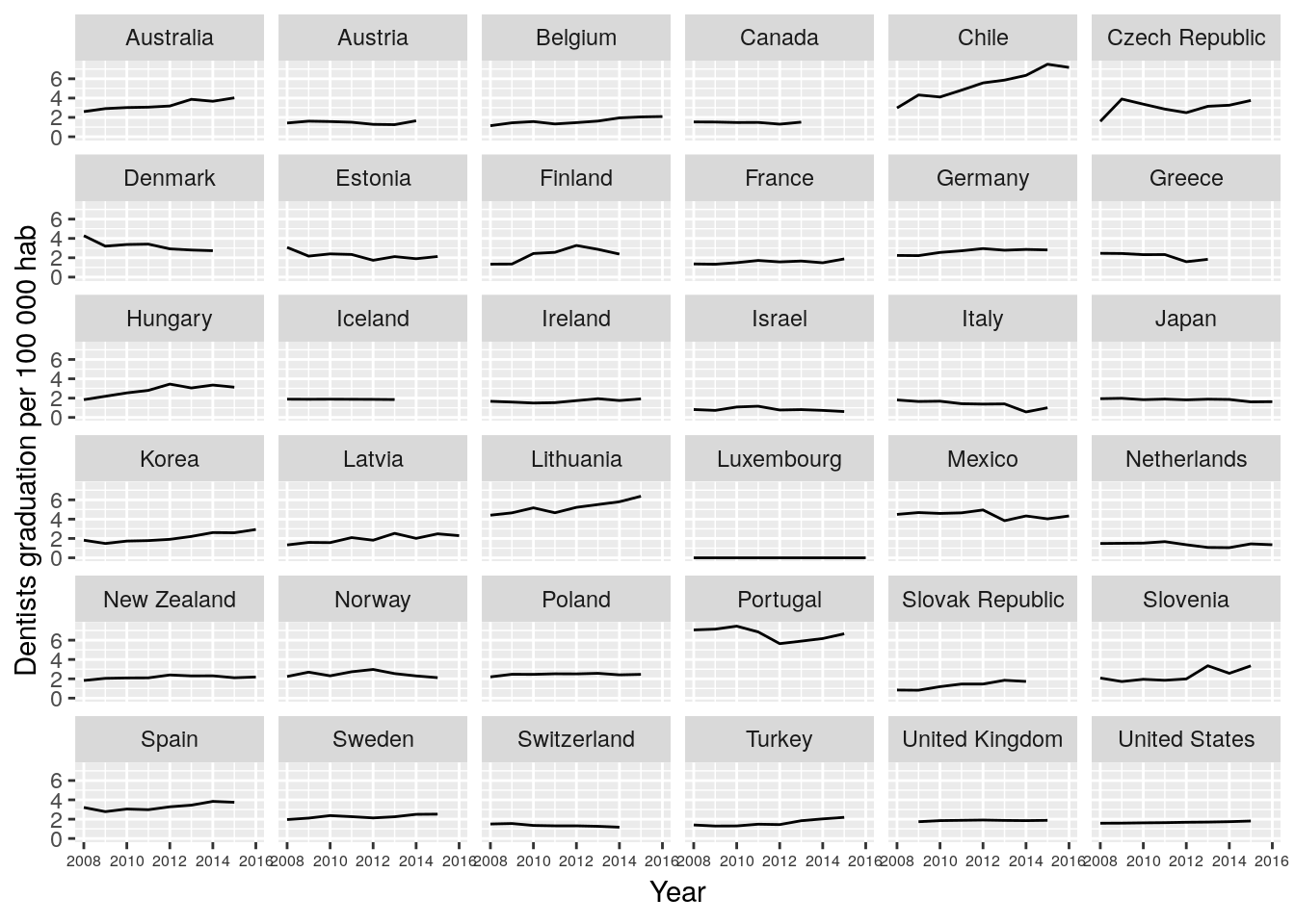
That’s much better. Some observations
- seem in general dentist graduating per 100 000 habitants has been stable in OECD countries,
- Chile seems to be increasing at a higher rate his graduation rate. Also Lithuania seems to share this trend.
- The line in Portugal is higher than in the rest of the countries
- Few countries decrease their graduation rate, seems that Denmark, Finland and Norway share this trend
TODO: learn how to order the plots, e.g. from higher rate to lower
We can transform the Value var using the log10. With ggplot2 we can directly add the transformation to any axis, as y-axis in this case. We use scale_y_log10(). Sometimes is worth to use to expand some small differences or to graph data with orders of magnitude of difference.
dent_oecd  %>%
  filter(Year < 2016) %>%
    ggplot(aes(x = Year, y = Value)) +
  geom_line() +
  facet_wrap(~Country) +
  theme(axis.text.x = element_text(size=6)) +
  labs(y = "log10 Dentists graduation per 100 000 hab") +
  scale_y_log10()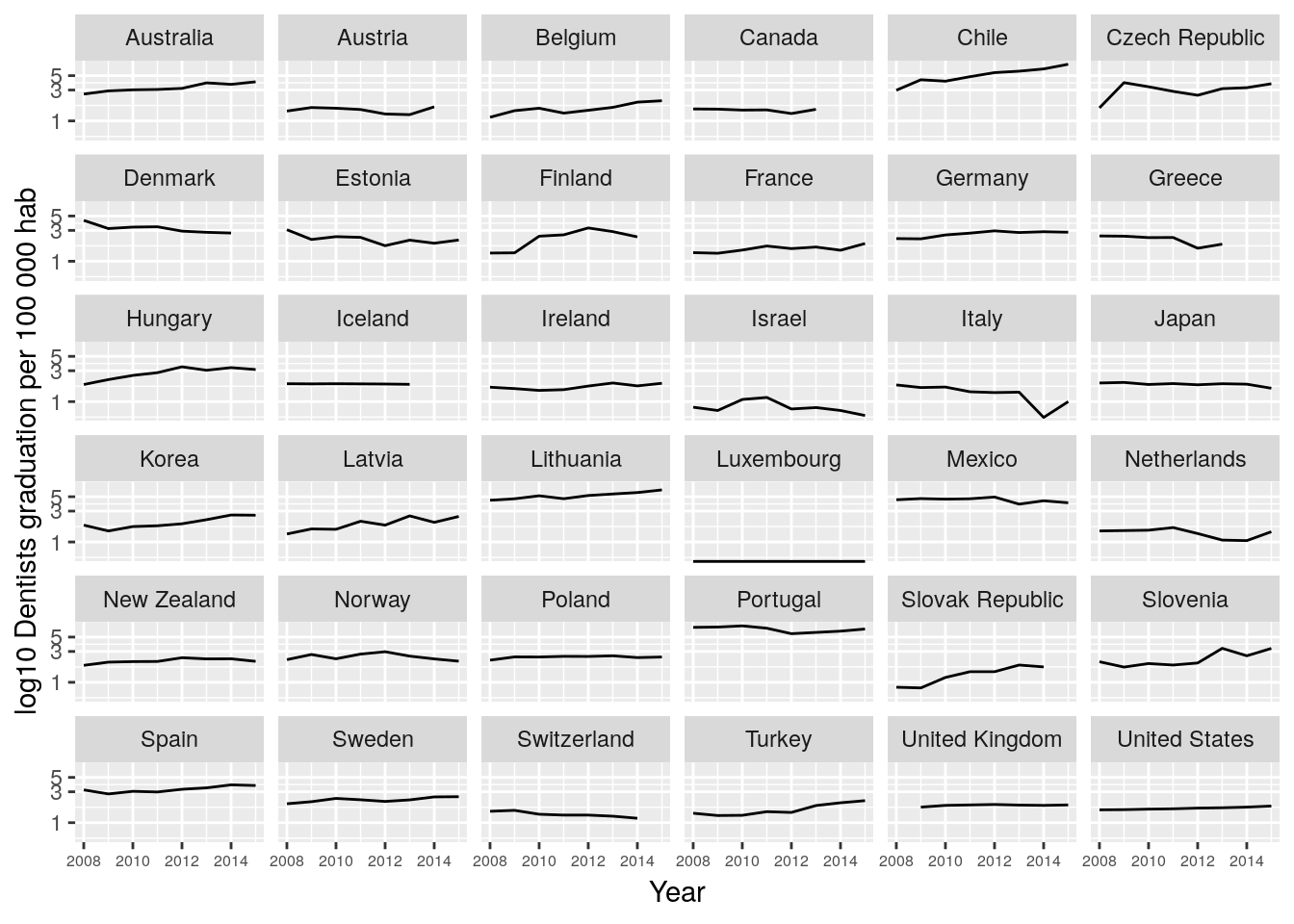
2. Using gghighlight
gghighlight is a package that highlight ggplot’s Lines and Points with Predicates
Remember the first graph:
dent_oecd %>%
  ggplot(aes(x = Year, y = Value, color = Country)) +
  geom_line() +
  labs(y = "Dentists graduation per 100 000 hab")
With gghighlight we can, as the name implies, highlight some lines according to a criteria or predicate.
dent_oecd %>%
  filter(Year < 2016) %>%
  gghighlight_line(aes(x = Year, y = Value, color = Country),
                   predicate = mean(Value) > 5) + # this is the threshold
labs(y = "Dentists graduation per 100 000 hab") 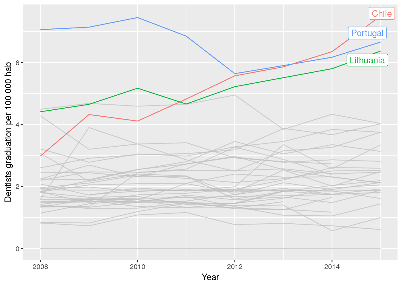
Pivot table
Pivot table in the dplyr way
dent_oecd %>%
  group_by(Country, Year) %>%
  summarise(average = mean(Value)) %>%
  spread(Year, average)
## # A tibble: 36 x 10
## # Groups: Country [36]
## Country `2008` `2009` `2010` `2011` `2012` `2013` `2014` `2015` `2016`
## <chr> <dbl> <dbl> <dbl> <dbl> <dbl> <dbl> <dbl> <dbl> <dbl>
## 1 Australia 2.6 2.91 3.02 3.06 3.18 3.87 3.67 4.02 NA
## 2 Austria 1.42 1.61 1.57 1.5 1.28 1.25 1.65 NA NA
## 3 Belgium 1.14 1.44 1.57 1.32 1.46 1.62 1.95 2.05 2.09
## 4 Canada 1.53 1.52 1.47 1.48 1.3 1.51 NA NA NA
## 5 Chile 2.98 4.32 4.11 4.82 5.57 5.86 6.35 7.5 7.17
## 6 Czech Re… 1.59 3.9 3.37 2.86 2.49 3.15 3.26 3.75 NA
## 7 Denmark 4.28 3.2 3.37 3.41 2.92 2.8 2.73 NA NA
## 8 Estonia 3.07 2.17 2.4 2.34 1.74 2.12 1.9 2.13 NA
## 9 Finland 1.34 1.35 2.44 2.56 3.27 2.87 2.38 NA NA
## 10 France 1.36 1.33 1.49 1.72 1.57 1.66 1.48 1.88 NA
## # … with 26 more rowsNow enhance the table with the package kableExtra:
install.packages("kableExtra")
library(kableExtra)
##
## Attaching package: 'kableExtra'
## The following object is masked from 'package:dplyr':
##
## group_rowsAddf the average as reference value
dent_oecd_avg <- dent_oecd %>%
  group_by(Year) %>%
  summarise(Value = mean(Value, na.omit = TRUE)) # create a new dataframe with the average per year

dent_oecd_avg[,"Country"] <- "OECD average"  # add a column and fill with a string
dent_oecd <- bind_rows(dent_oecd_avg, dent_oecd) # bind the dataframes by columns
rm(dent_oecd_avg) # remove the average dataset
First I create the table and store as an object called table_dent
table_dent <- dent_oecd %>%
  group_by(Country, Year) %>%
  summarise(average = mean(Value)) %>%
  spread(Year, average)
then apply the kable enhance to the object table_dent to show a nice formatted table:
knitr::kable(table_dent,
             caption = "Dentists graduating per 100 000 habs. OECD countries",
digits = 1)| Country | 2008 | 2009 | 2010 | 2011 | 2012 | 2013 | 2014 | 2015 | 2016 |
|---|---|---|---|---|---|---|---|---|---|
| Australia | 2.6 | 2.9 | 3.0 | 3.1 | 3.2 | 3.9 | 3.7 | 4.0 | NA |
| Austria | 1.4 | 1.6 | 1.6 | 1.5 | 1.3 | 1.2 | 1.6 | NA | NA |
| Belgium | 1.1 | 1.4 | 1.6 | 1.3 | 1.5 | 1.6 | 2.0 | 2.0 | 2.1 |
| Canada | 1.5 | 1.5 | 1.5 | 1.5 | 1.3 | 1.5 | NA | NA | NA |
| Chile | 3.0 | 4.3 | 4.1 | 4.8 | 5.6 | 5.9 | 6.3 | 7.5 | 7.2 |
| Czech Republic | 1.6 | 3.9 | 3.4 | 2.9 | 2.5 | 3.1 | 3.3 | 3.8 | NA |
| Denmark | 4.3 | 3.2 | 3.4 | 3.4 | 2.9 | 2.8 | 2.7 | NA | NA |
| Estonia | 3.1 | 2.2 | 2.4 | 2.3 | 1.7 | 2.1 | 1.9 | 2.1 | NA |
| Finland | 1.3 | 1.4 | 2.4 | 2.6 | 3.3 | 2.9 | 2.4 | NA | NA |
| France | 1.4 | 1.3 | 1.5 | 1.7 | 1.6 | 1.7 | 1.5 | 1.9 | NA |
| Germany | 2.2 | 2.2 | 2.5 | 2.7 | 3.0 | 2.8 | 2.9 | 2.8 | NA |
| Greece | 2.5 | 2.4 | 2.3 | 2.3 | 1.6 | 1.8 | NA | NA | NA |
| Hungary | 1.8 | 2.2 | 2.5 | 2.8 | 3.5 | 3.0 | 3.4 | 3.1 | NA |
| Iceland | 1.9 | 1.9 | 1.9 | 1.9 | 1.9 | 1.8 | NA | NA | NA |
| Ireland | 1.7 | 1.6 | 1.5 | 1.5 | 1.7 | 1.9 | 1.8 | 1.9 | NA |
| Israel | 0.8 | 0.7 | 1.1 | 1.2 | 0.8 | 0.8 | 0.7 | 0.6 | NA |
| Italy | 1.8 | 1.6 | 1.7 | 1.4 | 1.4 | 1.4 | 0.6 | 1.0 | NA |
| Japan | 1.9 | 2.0 | 1.8 | 1.9 | 1.8 | 1.9 | 1.9 | 1.6 | 1.6 |
| Korea | 1.8 | 1.5 | 1.7 | 1.8 | 1.9 | 2.2 | 2.6 | 2.6 | 2.9 |
| Latvia | 1.3 | 1.6 | 1.6 | 2.1 | 1.8 | 2.5 | 2.0 | 2.5 | 2.3 |
| Lithuania | 4.4 | 4.7 | 5.2 | 4.7 | 5.2 | 5.5 | 5.8 | 6.4 | NA |
| Luxembourg | 0.0 | 0.0 | 0.0 | 0.0 | 0.0 | 0.0 | 0.0 | 0.0 | 0.0 |
| Mexico | 4.5 | 4.7 | 4.6 | 4.7 | 5.0 | 3.8 | 4.3 | 4.0 | 4.3 |
| Netherlands | 1.5 | 1.5 | 1.5 | 1.7 | 1.4 | 1.1 | 1.1 | 1.4 | 1.4 |
| New Zealand | 1.8 | 2.0 | 2.1 | 2.1 | 2.4 | 2.3 | 2.3 | 2.1 | 2.2 |
| Norway | 2.2 | 2.7 | 2.3 | 2.7 | 3.0 | 2.5 | 2.3 | 2.1 | NA |
| OECD average | 2.2 | 2.2 | 2.3 | 2.4 | 2.3 | 2.5 | 2.5 | 2.8 | 2.7 |
| Poland | 2.2 | 2.5 | 2.5 | 2.5 | 2.5 | 2.6 | 2.4 | 2.5 | NA |
| Portugal | 7.1 | 7.1 | 7.5 | 6.8 | 5.6 | 5.9 | 6.2 | 6.7 | NA |
| Slovak Republic | 0.8 | 0.8 | 1.2 | 1.5 | 1.5 | 1.8 | 1.7 | NA | NA |
| Slovenia | 2.1 | 1.7 | 2.0 | 1.8 | 2.0 | 3.4 | 2.6 | 3.3 | NA |
| Spain | 3.2 | 2.8 | 3.0 | 3.0 | 3.3 | 3.5 | 3.8 | 3.8 | NA |
| Sweden | 2.0 | 2.1 | 2.4 | 2.3 | 2.1 | 2.2 | 2.5 | 2.5 | NA |
| Switzerland | 1.5 | 1.6 | 1.4 | 1.3 | 1.3 | 1.3 | 1.2 | NA | NA |
| Turkey | 1.4 | 1.3 | 1.3 | 1.5 | 1.4 | 1.8 | 2.0 | 2.2 | NA |
| United Kingdom | NA | 1.7 | 1.8 | 1.9 | 1.9 | 1.9 | 1.8 | 1.9 | NA |
| United States | 1.6 | 1.6 | 1.6 | 1.6 | 1.7 | 1.7 | 1.7 | 1.8 | NA |
More information about ggplot2