Package
The packages are additional functionalities that can be installed to Rstudio. Think of the apps on your phone, which can do different things.
There are several ways to install them, but the simplest is through a package called pacman, but first we need to install the package pacman
if (!require("pacman")) install.packages("pacman")Then, every time we need a new package, we invoke the command by
pacman::p_load(tidyverse,
               palmerpenguins)
The packages are installed only once (just like the apps on your phone), but you need to call them every time you want to use them (just like the apps on your phone)
How to code in R using RStudio
Writing code is different from writing a letter or a mail. While a mail is written to another person, the code is written to be read by a machine. And unlike the person, the machine does not interpret the intent of the writer. Thus, if I write with some spelling or grammatical error, another person can understand the idea. However, a machine that finds an error could not go on.
Mistakes in writing code are inevitable and we all make them. The important thing is that you are able to detect where the error is, and that task is simpler when you write well-formatted code. For example look at these two codes:
# Code 1
penguins %>% ggplot(aes(x=bill_length_mm,y=body_mass_g))+geom_point()
# Code 2
penguins %>%
ggplot(aes(x = bill_length_mm,
y = body_mass_g)) +
geom_point() 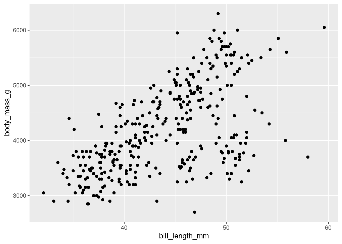
Both are identical, but the format of the second one allows you to read it better and in case there is any error it will be easier to detect. The code is written for machines, but one of the ideas of tidyverse is that a human can also read and interpret it.
Here are some tips for writing better code:
- use the shortcuts:
- CTRL + ALT + I: insert a chunk of code
- CTRL + ALT + M: insert the pipe operator %>%
- ALT + - : insert the <- assignment operator
- Select the code and press CTRL * SHIFT + A: autoformat the code
- Select the code and press CTRL + ENTER : run the code
Try these shortcuts until you are familiar with them Note, this shortcuts only run inside a code chunk
So, add a code chunk here and try all the rest of the shorcuts
- comment all your code
Do your future self a favor and comment your code.
Everything that is after a # sign will not be executed and considered as a comment, e.g.
x <- c(1:10) # here is my comment about this line
# I can also write here! - Capitalization matters
Execute this code and found the errors
# mean(X)# Mean(x)Packages
The pacman command allows to easy install other packages
If not installed, write
install.packages(“pacman”)
pacman::p_load(tidyverse,
               palmerpenguins )
Dataset
Now I will load the penguins dataset to my environment (check the upper right panel, the ENVIROMENT tab)
data(penguins)EXPLORE THE DATASET
With the View() command you can open the dataset in an external tab, as an spreadsheet, but you will not be able to modify it. And that’s a good thing, remember: don’t touch your data!
# View(penguins)With the dim() commando, you can see the DIMensions of the dataset, in rows and columns
dim(penguins)## [1] 344 8I can explore the first six rows of the dataset, and this one of the first things that I do when I have some data
head(penguins)## # A tibble: 6 x 8
## species island bill_length_mm bill_depth_mm flipper_length_… body_mass_g sex
## <fct> <fct> <dbl> <dbl> <int> <int> <fct>
## 1 Adelie Torge… 39.1 18.7 181 3750 male
## 2 Adelie Torge… 39.5 17.4 186 3800 fema…
## 3 Adelie Torge… 40.3 18 195 3250 fema…
## 4 Adelie Torge… NA NA NA NA <NA>
## 5 Adelie Torge… 36.7 19.3 193 3450 fema…
## 6 Adelie Torge… 39.3 20.6 190 3650 male
## # … with 1 more variable: year <int>and also the last six rows
tail(penguins)## # A tibble: 6 x 8
## species island bill_length_mm bill_depth_mm flipper_length_… body_mass_g sex
## <fct> <fct> <dbl> <dbl> <int> <int> <fct>
## 1 Chinst… Dream 45.7 17 195 3650 fema…
## 2 Chinst… Dream 55.8 19.8 207 4000 male
## 3 Chinst… Dream 43.5 18.1 202 3400 fema…
## 4 Chinst… Dream 49.6 18.2 193 3775 male
## 5 Chinst… Dream 50.8 19 210 4100 male
## 6 Chinst… Dream 50.2 18.7 198 3775 fema…
## # … with 1 more variable: year <int>With the str(), you can see the STRucture of your dataset (or dataframe). Note that indicates the class and the levels of each categorical (or factor) variable. Also, you see the dimensions in the first line.
It tell us that this dataset is a tibble, a especial kind of dataset, that has 344 rows per 8 columns
str(penguins)## tibble [344 × 8] (S3: tbl_df/tbl/data.frame)
## $ species : Factor w/ 3 levels "Adelie","Chinstrap",..: 1 1 1 1 1 1 1 1 1 1 ...
## $ island : Factor w/ 3 levels "Biscoe","Dream",..: 3 3 3 3 3 3 3 3 3 3 ...
## $ bill_length_mm : num [1:344] 39.1 39.5 40.3 NA 36.7 39.3 38.9 39.2 34.1 42 ...
## $ bill_depth_mm : num [1:344] 18.7 17.4 18 NA 19.3 20.6 17.8 19.6 18.1 20.2 ...
## $ flipper_length_mm: int [1:344] 181 186 195 NA 193 190 181 195 193 190 ...
## $ body_mass_g : int [1:344] 3750 3800 3250 NA 3450 3650 3625 4675 3475 4250 ...
## $ sex : Factor w/ 2 levels "female","male": 2 1 1 NA 1 2 1 2 NA NA ...
## $ year : int [1:344] 2007 2007 2007 2007 2007 2007 2007 2007 2007 2007 ...The str() is super useful and also one of the first things that you have to examine about your data, and consult several times during your data analysis.
The tidyverse version of str() is the glimpse() command
glimpse(penguins)## Rows: 344
## Columns: 8
## $ species <fct> Adelie, Adelie, Adelie, Adelie, Adelie, Adelie, Ade…
## $ island <fct> Torgersen, Torgersen, Torgersen, Torgersen, Torgers…
## $ bill_length_mm <dbl> 39.1, 39.5, 40.3, NA, 36.7, 39.3, 38.9, 39.2, 34.1,…
## $ bill_depth_mm <dbl> 18.7, 17.4, 18.0, NA, 19.3, 20.6, 17.8, 19.6, 18.1,…
## $ flipper_length_mm <int> 181, 186, 195, NA, 193, 190, 181, 195, 193, 190, 18…
## $ body_mass_g <int> 3750, 3800, 3250, NA, 3450, 3650, 3625, 4675, 3475,…
## $ sex <fct> male, female, female, NA, female, male, female, mal…
## $ year <int> 2007, 2007, 2007, 2007, 2007, 2007, 2007, 2007, 200…The difference between str and glimpse is not much. Glimpse adapts the result to the size of the screen.
Try reducing the size of this window and running first str and then glimpse. Compare the results.
To see a summary of all the variables, we have the following command
It shows us central tendency and dispersion measures for continuous data and a count for categorical data. For both it also shows us the amount of unavailable data or NA
summary(penguins)## species island bill_length_mm bill_depth_mm
## Adelie :152 Biscoe :168 Min. :32.10 Min. :13.10
## Chinstrap: 68 Dream :124 1st Qu.:39.23 1st Qu.:15.60
## Gentoo :124 Torgersen: 52 Median :44.45 Median :17.30
## Mean :43.92 Mean :17.15
## 3rd Qu.:48.50 3rd Qu.:18.70
## Max. :59.60 Max. :21.50
## NA's :2 NA's :2
## flipper_length_mm body_mass_g sex year
## Min. :172.0 Min. :2700 female:165 Min. :2007
## 1st Qu.:190.0 1st Qu.:3550 male :168 1st Qu.:2007
## Median :197.0 Median :4050 NA's : 11 Median :2008
## Mean :200.9 Mean :4202 Mean :2008
## 3rd Qu.:213.0 3rd Qu.:4750 3rd Qu.:2009
## Max. :231.0 Max. :6300 Max. :2009
## NA's :2 NA's :2To see the summary of a particular variable, you can select it with $ in the following way:
dataset$column
for example
summary(penguins$species)## Adelie Chinstrap Gentoo
## 152 68 124| EXERCISES |
| try getting the summary of island |
r # write your code here |
| and now the summary of body_mass_g |
r # write your code here |
As you saw in the summary of all variables, R automatically detects the type or class of variable.
To check the class of a variable, we use the command:
class(dataset$variable_to_check)
For example:
class(penguins$year)## [1] "integer"Sometimes a number can be used to store a categorical variable, such as assigning a number to each sex. In general, I do not recommend using numbers to store nominal variables, but simply to store the variable as it is presented, for example male and female instead of 1 and 2.
For example, if we consult the summary of the year variable, we get the following:
| EXERCISES |
| Try finding the classes of other variables |
summary(penguins$year)## Min. 1st Qu. Median Mean 3rd Qu. Max.
## 2007 2007 2008 2008 2009 2009R recognizes the year as a numerical variable. However, the year is indeed a categorical variable. Nobody says: “I was born in 1997.4” for example,
To change the type of variable we have to reassign the modified variable.
For example, to change the variable year from number to factor, we have to overwrite the variable year
penguins$year <- as.factor(penguins$year) now the year variable should be correctly formatted
summary(penguins$year)## 2007 2008 2009
## 110 114 120Now it’s fixed!
Exploring the dataset with tables
A simple way to explore a dataset is by means of tables. This is done with the command (table(variable1, variable2))
For example, let’s look at the distribution of sex for each species
table(penguins$species,
      penguins$sex)
##
## female male
## Adelie 73 73
## Chinstrap 34 34
## Gentoo 58 61The command tables show the result of (rows, columns)
For example, if we change the order, we will obtain this
table(penguins$sex,
      penguins$species)
##
## Adelie Chinstrap Gentoo
## female 73 34 58
## male 73 34 61| Exercise |
| + Try making a chart to see the total number of penguins per island. + Now by island and by year + Try changing the order: how does it look better? + What happens if you make a table of a numerical variable? |
CREATING GRAPHS WITH GGPLOT2
ggplot stands for grammar of graphics.
Just as language has rules with which to communicate any idea, graphics have a grammar. If we understand the components of a graph and how the different parts that make up a graph are related, we can create any type of visualization to communicate a result.
Essentially, to make a graphic we need three things:
- the data,
- the mapping of the variables to visual properties of the graph. The mappings are placed within the aes function (where aes stands for aesthetics), for example, position, size, color, shape, and
- a geometric shape that represents the data in the mapping. Geoms are the geometric objects (points, lines, bars, etc.) that can be placed on a graph. They are added using functions that start with geom_.
So the first thing we need is the data
penguins %>%  # the data
  ggplot()    # means: "hey ggplot, take this data, and wait for instructions"
Secondly, we map the variables of interest
Usually this is done this way:
penguins %>%
  ggplot(
    mapping =                  # we can omit this line, I wrote it here just for you to see what the mapping refers to
      aes(x = bill_length_mm,  # hey ggplot, map these aesthetic variables, in the x axis this variable
          y = body_mass_g))    # and in the y axis this other
Since I personally omit the mapping, I write:
penguins %>%
  ggplot(aes(x = bill_length_mm,
             y = body_mass_g))
and the result is the same.
we can skip other things, but I don’t recommend it. For example, you can write:
penguins %>%
ggplot(aes(bill_length_mm, body_mass_g)) 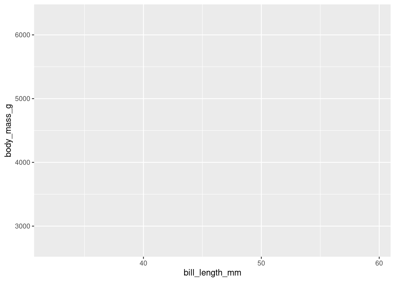
Now we should tell ggplot how to map those x and y variables. In this case, we will choose to map them as points.
penguins %>%
  ggplot(aes(x = bill_length_mm,
             y = body_mass_g)) +
  geom_point()  # this is the geometric object that will map the aesthetic
Later, we add more layers as aesthetics elements.
For example, we can add a color to each point to identify the sex. We add this as an additional aesthetic, see code below
penguins %>%
  drop_na() %>%
  ggplot(aes(x = bill_length_mm,
             y = body_mass_g)) +
  geom_point() +
  aes(color = sex)  # this is the additional layer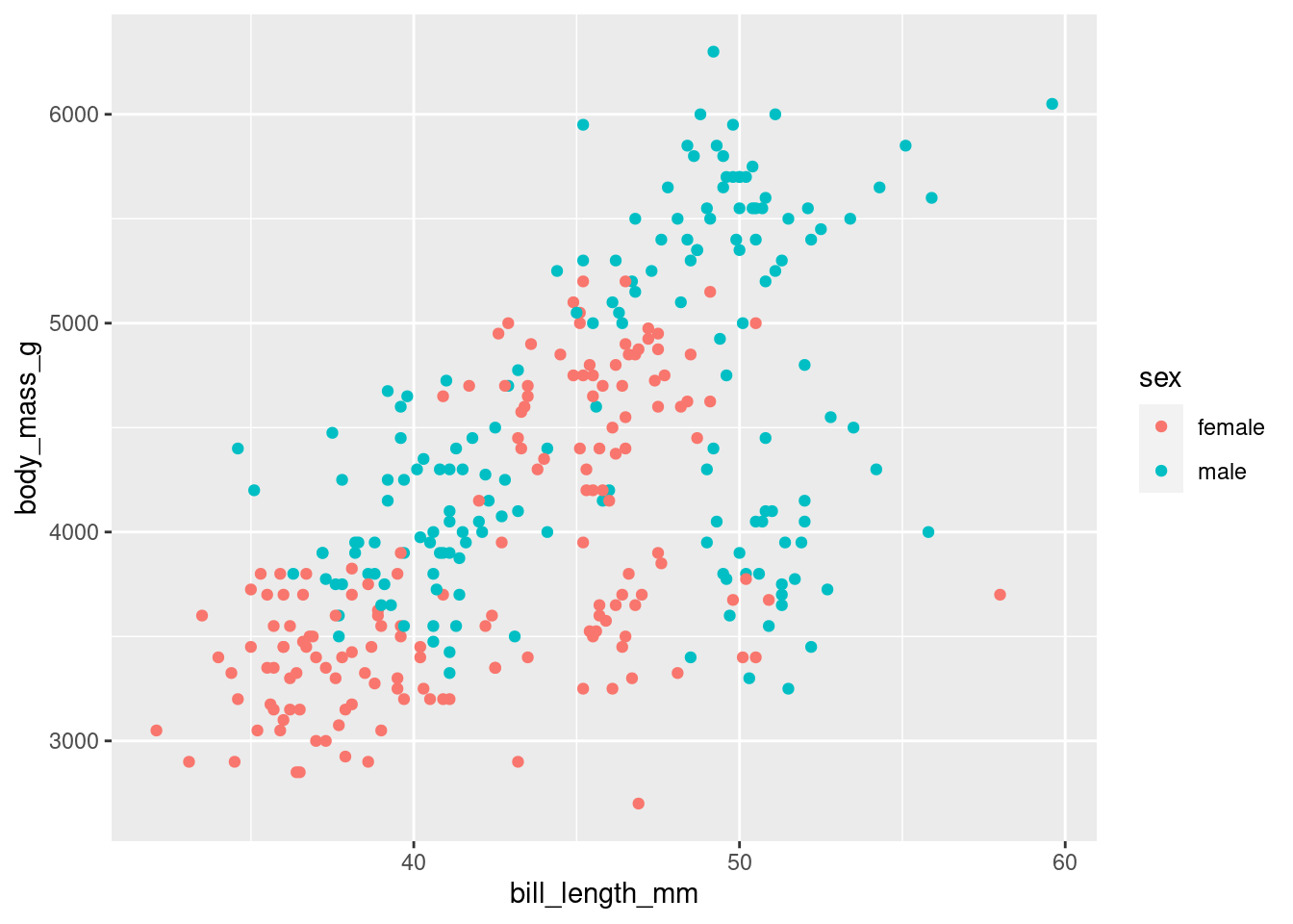
EXCERCISE
Now it is your turn, we could ask: how is the distribution of the bill_depth_mm vs. the flipper_length_mm?
# write your code hereThere is a separate group of points: what could be due to a particular sex or species? Make a chart to find out!
EXERCISES
geom_point
If you have two continuous variables, the geom_point is the preferred option to graph
Try plotting the bill_length_mm in the x axis vs the bill_depth_mm
# penguins %>%
#  ggplot(aes(x = _____________,
#             y = _____________)) +
# geom_point()
You can add more layers as aesthetics elements. For example, if you want to visualize the previous graph but with species, you can add an additional layer coloring each point with the sex variable
# penguins %>%
#  ggplot(aes(x = _____________,
#             y = _____________,
#             color = _________)) +
#  geom_point()
and we can add several additional aesthetics layers, as
shape = for discrete or categorical variables, as sex size = for continuous variables, as body_mass_g
and also we can add more geom layers. For example, we can add a regression line to explore the correlation between the plotted variables.
Try adding a geom_smooth(method = “lm”) after the last geom and check the results
# penguins %>%
#  ggplot(aes(x = bill_length_mm,
#             y = bill_depth_mm)) +
#  geom_point() +
#  ________________
What can you conclude about the relationship between these two variables?
Now try disaggregating by species.
Hint: mark the species with colors
We can add more variables depending on your nature.
For example, we can change the size of each point according to some numerical variable, such as the body_mass_g
try completing this code
# penguins %>%
#  ggplot(aes(x = bill_length_mm,
#             y = bill_depth_mm,
#             color = species,
#             size = ___________) +
#  geom_point()
Tuning your graph
Themes
You can change the theme of the graph, the visual appearence, changing the layer that control this, with the commando theme and choosing your theme of preference
penguins %>%
  ggplot(aes(x = bill_length_mm,
             y = flipper_length_mm,
             color = species))  +
  geom_point() +
  theme_minimal()   # this is one example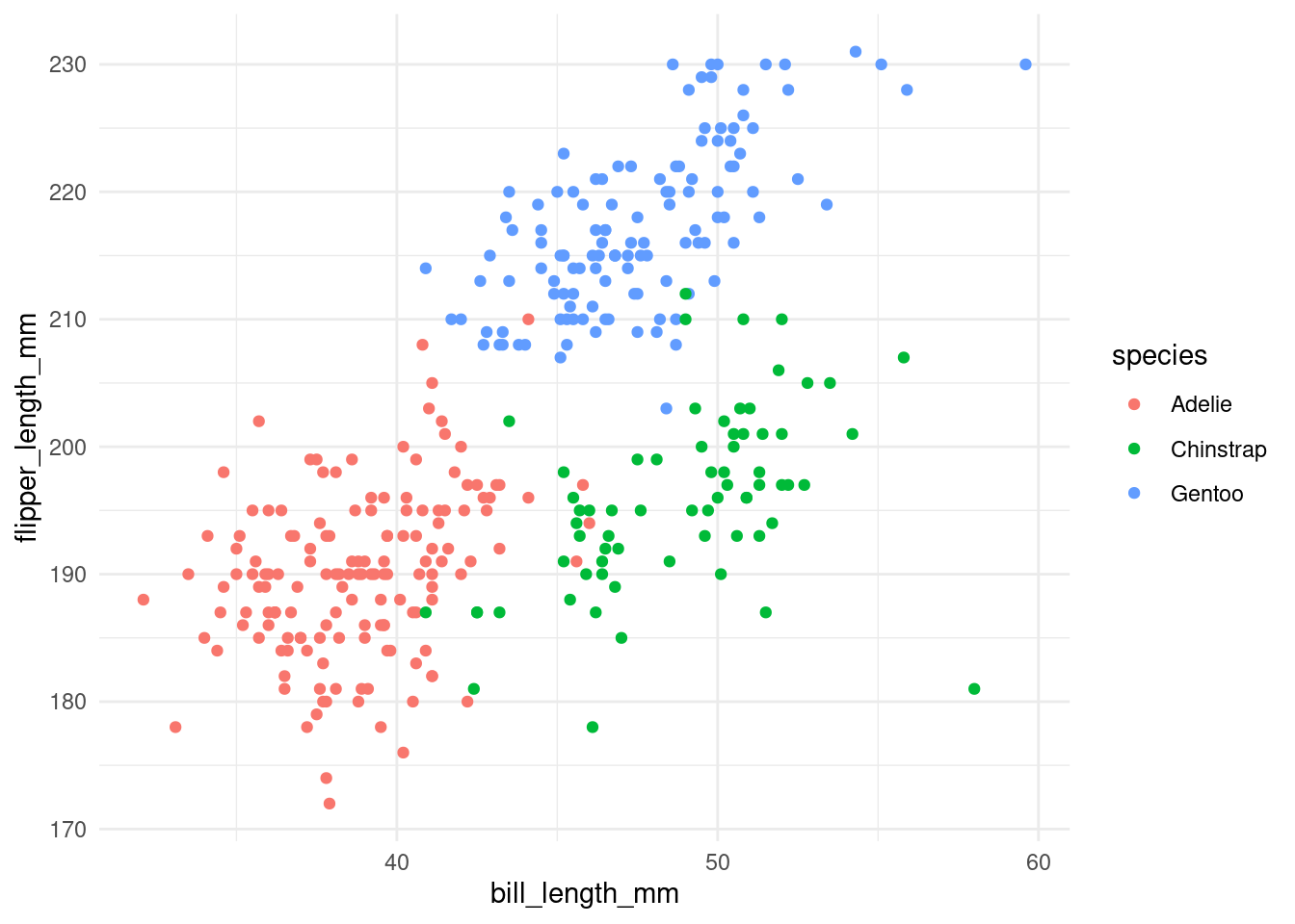
penguins %>%
ggplot(aes(x = bill_length_mm,
y = flipper_length_mm,
color = species)) +
geom_point() +
theme_dark() # now a dark theme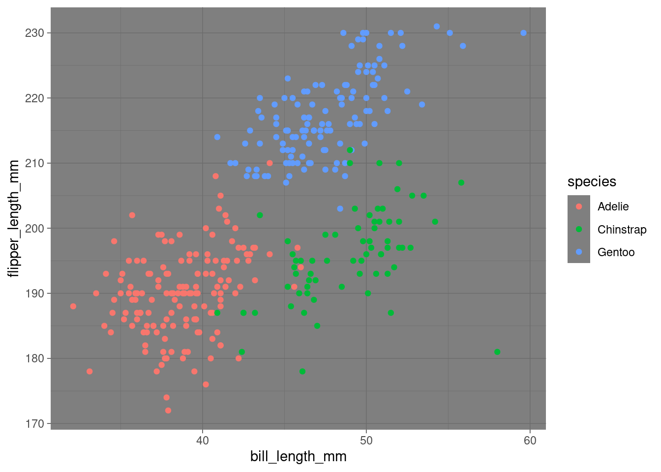 Try others!
try theme_linedraw() theme_light()
penguins %>%
ggplot(aes(x = bill_length_mm,
y = flipper_length_mm,
color = species)) + # in this case, here
geom_point() 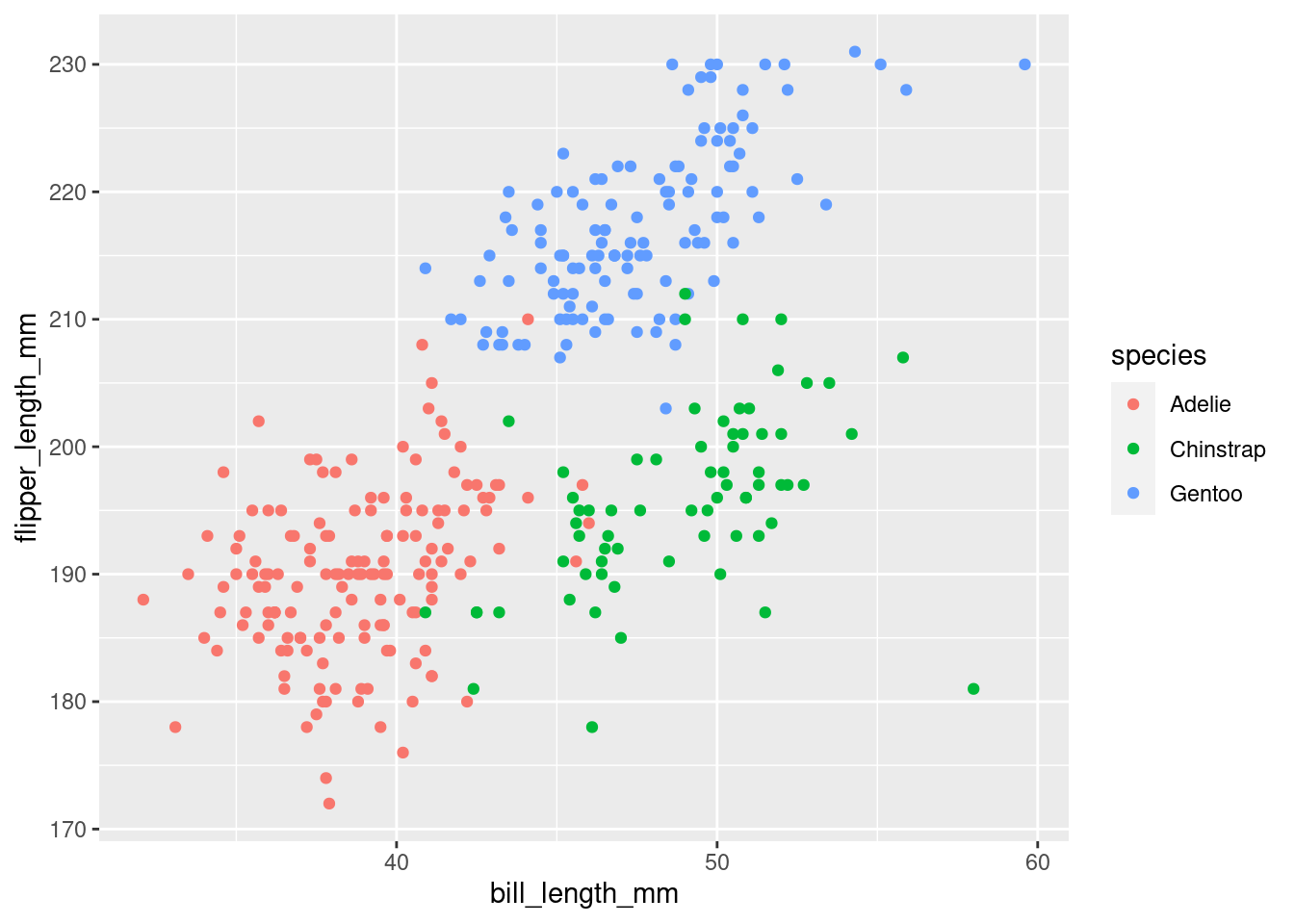 You can also install more themes or create your own theme
Some packages with additional themes are:
ggpubr (I use mostly the minimal and some of the ggpubr package) and ggthemes
To install use
pacman::p_load(ggthemes)and then
penguins %>%
ggplot(aes(x = bill_length_mm,
y = flipper_length_mm,
color = species)) + # in this case, here
geom_point() +
ggthemes::theme_economist() # here I say" from the package ggthemes use the theme_economist()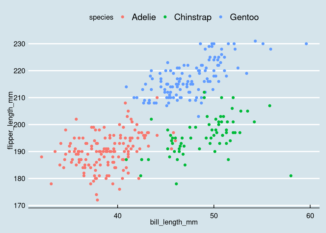 You can try these themes:
- ggthemes::theme_solarized()
- ggthemes::theme_excel()
Headings and labels
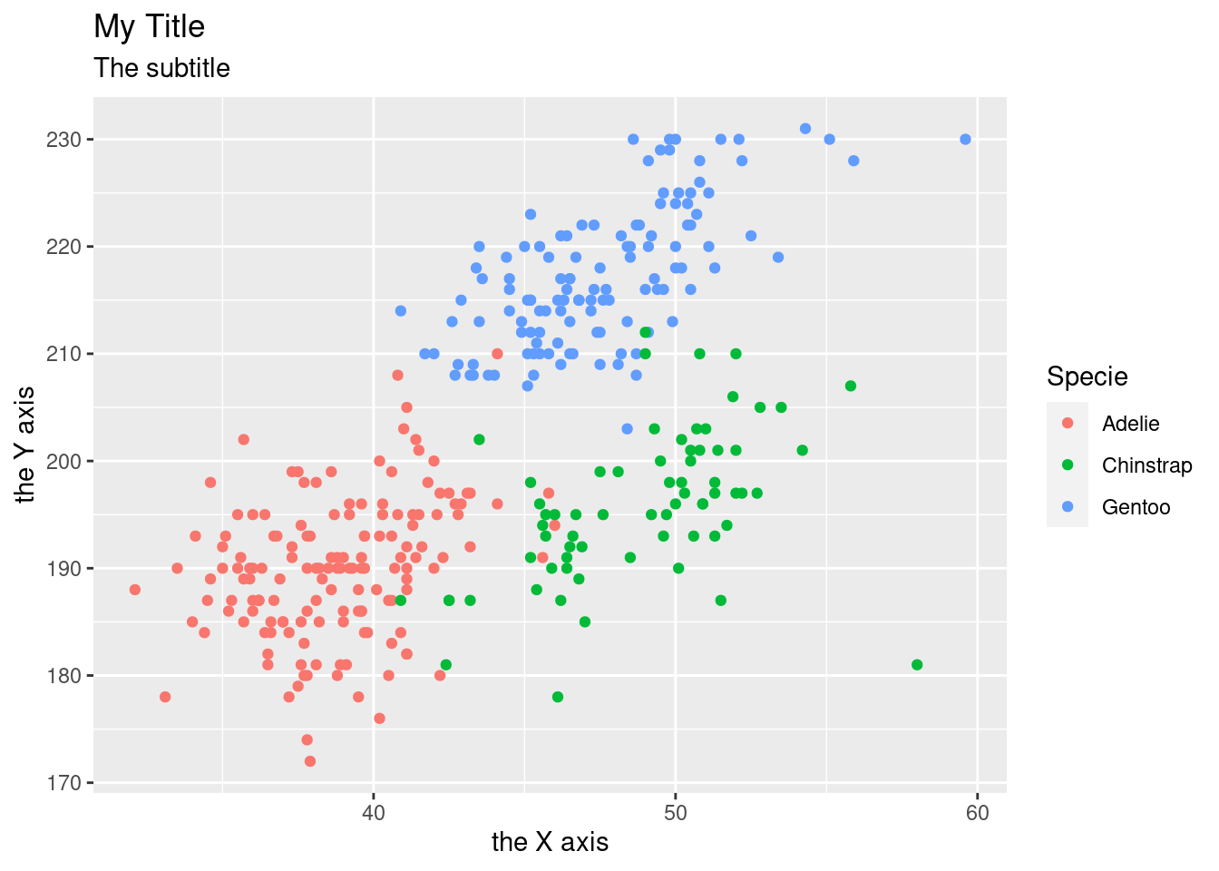
You can add and change the labels with labs()
penguins %>%
  ggplot(aes(x = bill_length_mm,
             y = flipper_length_mm,
             color = species))  +
  geom_point()  +
  labs(
    title = "My Title",
    subtitle = "The subtitle",
    x = "the X axis",
    y = "the Y axis",
    color = "Specie"
  )
Try to answer these questions:
What is the relationship between Penguin mass vs. flipper length ?
And between Flipper length vs. bill length?
Note
You will find this kind of notation in books and posts, where the data goes inside the ggplot command. For example:
ggplot(data = penguins) +
  (mapping = aes(x = species,
                 y = body_mass_g,
                 color = sex)) +
  geom_boxplot() +
  theme_minimal()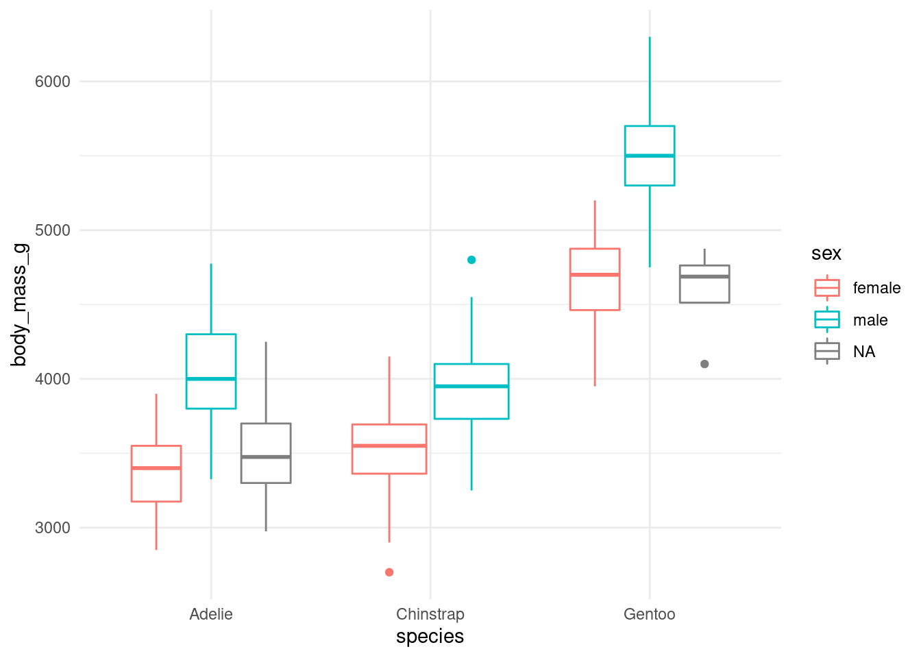
I prefer to leave the data out of the ggplot command, since it’s easier to perform some data transformation and then plot it.